| 10/20/13
I haven't blogged for
awhile. As you can tell from my posts, my focus has changed from drawing to
painting. This year I found these awesome painting videos from Scott Waddell
and have been watching them over and over. His classical painting method is
similar to what I learned from Darren Kingsley's workshop. Scott explains
every step in detail, even how he mixes colors. I highly recommend anyone who
wants to paint in the classical realism style to download Scott's videos. They
are very inexpensive but invaluable for learning to paint.
|
Be the first to post a comment.
|
3/17/13
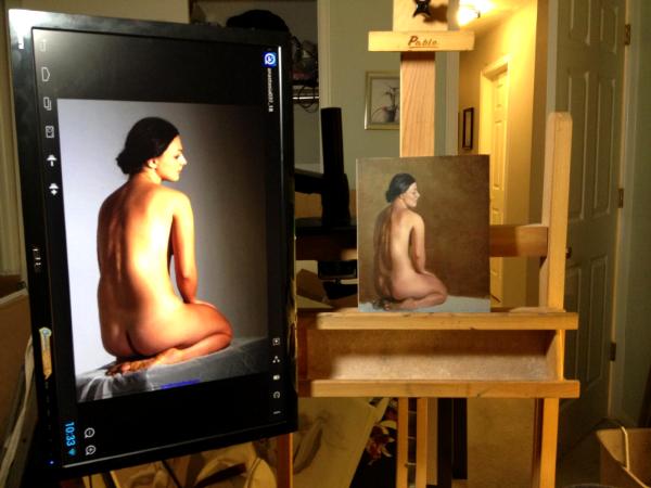
Most of my well known artist friends have been painting from
computer monitors, I've decided to go digital as well. This will save me from
printing those expensive color prints and give me the flexibility to zoom in
and look at more details. Being the geek that I am. I researched came up with
this setup. It worked so well I thought I share it.
First of all I don't want to buy another computer just to
display photos. I want to minimize the cords and the space needed for a key
board and mouse. Second, I wanted to be able to adjust the height because sometimes
I paint standing and sometimes sitting. I also wanted to be able to rotate the
screen 90 degrees to take advantage of the screen size when painting portraits.
The monitor has to be thin and light because I need the monitor to be on the
left of the easel and there's no place to mount it other than the easel. Here's
what I came up with:
 |
The Android computer was less than $50 and it's very small. Plugs
directly into the computer monitor via HDMI. It has dual core CPU and built in
wifi. Everything I needed. This little computer can be found on Amazon under
MK808 (there are new ones coming out all the time, at the time when I ordered
there was already a MK808B with Bluetooth and even a quad core version).
I got the 24 inch ASUS monitor VS248H-P because it has HDMI
input so I can plug in the Android computer. It also has VESA mounting holes so
I can mount it on a monitor arm. It is very thin and light so it won't tip my
easel over.
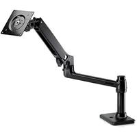
Found this monitor arm with a desk mount that allowed me to
mount it on a vertical bar on my easel. It's branded HP but actually made by
Ergotron. The arm is very strong and provide all kinds of movement. The HP
branded arm is all black but it's $20 cheaper at $84.99. I highly recommend
this arm.
I got a iPazzPort fly air mouse so I wouldn't have to have desk
space for a mouse and keyboard. It works well for bring up photos but probably
will use a real mouse if I want to edit a photo. I could probably have gotten a
touch screen but didn't want to get oil paint all over the screen.
I'm pretty happy with the setup. Might have gone a bit over
board with the 24 inch monitor but just have to push it back a bit. It's really
amazing how much the price has come down for such a computer system and things
are getting better and cheaper all the time.
|
Be the first to post a comment.
|
1/5/13Received a scam in the email that look like the following. I'm glad I was able to find Kathleen's blog about this scam. Hello,
Hope this message finds you well. I saw some creative works on your website and I must commend you are really doing a wonderful and captivating work.
I will like you to get back with more details if they are still available for purchase.
Orchids
Erin
Sam
I will appreciate an urgent reply.
Best Regards,
Helen Brown |
2 comments | Post comment
 | Nothing, I just ignored it after finding reports on Kathleen's blog. | -- William Char, 1/21/13
|
 | I just got one of these emails, what happend.. | -- Paul D Wilbur, 1/15/13
|
|
| 10/20/12 David Kassan is one of my favorite artists. I'm sharing this on my blog because I've learned a ton by watching this. Thank you David for providing this free video on YouTube! |
Be the first to post a comment.
|
9/9/12
Recently I've been watching a lot of videos purchased from
the Interweave store. I used to pay double for some of the video's on there so
they are really affordable (especially when they have sales). Best of all you
can down load the video directly instead of waiting for the DVD to be shipped. These
are the artists that I've viewed so far and highly recommend them. I'm sure
you can see their influences in my art work. ·
Daniel Greene
·
Dan Thompson
·
Jon deMartin
·
Scott Burdick and Daniel Gerhartz
·
Susan Lyon
·
Rob Liberace
Thank you Interweave store for making these affordable top notch
art instruction videos available!
|
Be the first to post a comment.
|
5/6/12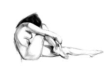 |
Even though I am a computer programmer, I've never got into using digital tools for my art work. I've always thought computer graphic tools lack the tactile touch that I needed and too complicated to allow me to be spontaneous (not that I am spontaneous). Well, this week I've discovered an app on my iPad that comes close. It's called ASketch. It renders lines and shading almost like charcoal and it was so fun drawing on it.
I also went out and bought a Targus stylus. I just don't like drawing with my fat fingers. I must say that even with a stylus the capacitive screen still not responsive enough. Many times I have difficulty getting the line I want because of the fat rubber tip of the stylus.
Another thing I discovered today is a web site called Figure Drawing Training Tool. It flashes photos at you at specified time interval for gesture drawing. Some of the photos are really good. With the Figure Drawing Training Tool and the ASketch iPad app, one can have a great time at home practice gesture drawings without killing bunch of trees.
|
1 comment | Post comment
| Didn't know this Ipad feature..another way to be creative, it's amazing! http://framesdirect-internorm.co.uk/i nternorm/windows/triple-glazing.html | -- Coleman, 10/22/12
|
|
4/28/12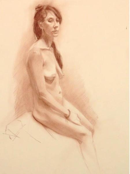 |
It's been awhile since I've updated my blog as a friend has gently reminded me. Last year has been a year of learning new skills. The workshop I took with Darren Kingsley really changed the way how I think about drawing the figure. The concept of drawing like you're sculpting has really helped me see each shape as Plaines which gives my drawing a much solid structure. Darren teaches at the Studio Incamminati. I asked him what does the student at the school focus on for the first year and he said they work strictly in monochrome. Therefore I decided to spent the year painting Grisailles. I would use a limited palette of just Burnt Umber, Raw Umber, Burnt Sienna, Ivory Black, Flake White (sometimes Titanium White), with a little of vermilion to punch up the reflected lights. My early attempt at painting grisailles were pretty bad. For some reason I wasn't able to transfer my drawing skills to my painting. I decided to go back to drawing again, focusing on the sculpting the form. After half of a year I think my drawing has definitely improved. Combining what I learned from Susan Lyon and Darren Kingsley has allow my drawings to look soft but with good structure. Watching Robert Liberace's DVD on grisaille has also helped a lot. Even Quang Ho mentioned that he sees a big improvement in my artwork since my workshop. 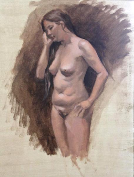 |
I've started back on my grisailles. My focus is really still on good drawing with the brush, and watching my values (and chroma). This time, I believe going back to drawing has helped my painting efforts a lot. |
1 comment | Post comment
| About time ..... :) Your work is Looking to me nothing short of Stunning In places ....SH | -- Sandra, 5/13/12
|
|
6/28/11I am trying out my first glazing oil painting as a final project for my oil painting class with Andrea Kemp. I've chosen a photo taken back in 2009 in an orchid show in San Franciso. This is the first pass at the Grisaille. It might be a bit thick but we'll see. Finally I'm painting something that my mom always asked for. By the way Andrea Kemp is a great teacher and I highly recommend taking her class at the Denver Art Students League.  |
My oil painting class with Andrea Kemp is over and here is how my galzing project turned out. It turned out that my underpainting of the blossoms were too dark so I had to put some pink mixed with white to get it lighter. Also tried to glaze the background but it was too hard to get it smooth with transparent dark so I went over it with thicker paint. Overall I am pleased with how it turned out for my first glazed painting. The process was pretty simple but tedious. A bit like paint by number as I have to paint those layers and layers and keep it inside the line. |
2 comments | Post comment
| I really love your oil painting! I wish I could also paint like this. <a href="http://framesdirect-internorm.co.uk/"><strong>triple glazing</strong></a><strong></strong> | -- Brian, 4/23/12
|
| I cant wait to see you paint this , I know it will be beautiful ~Will, you are hammering the oils of late!! | -- Sandra, 6/29/11
|
|
6/6/11I am attending the Darren Kingley workshop for the next two week and will record my progress in the class. We spent the 1st day doing a block in of the model. The block in is done with 6B 2mm lead pencil on Strathmore 500 2ply bristol paper. Strathmore bristol comes in Plate (smooth) or Vallum (more tooth). The plate turned out to be a bit too smooth. Darren recommends using the 4 ply instead.
Day 2, spent the day getting more accurate with the contour then started block in. Used 2B and 6B to get the darks. However, this is just laying in some values to start getting the forms to turn. Additional passes will get the forms darker and toward the right values. Day 3, We continued to block in the figure. The technique is more like sculpting, pushing and turning the form as if chiselling the edge of the form. We then proceeded to refine the shapes by pushing the values.
Day 4. We spent today polishing the drawing. We used paper towl and wipe the drawing to add some tone to the whites and pick out some highlights using eraser pencils. We also used a brush to push some of the darks.
BACAA doesn't allow students taking photos of their own work inside the school and my photo didn't turn out because it got all washed out in the sun. Here is a link to the schools photos instead.
Day 5. Worked on the head, hands and legs today. Flushed out the head and corrected the hands and legs. Didn't have enough time to really polish the hands and the legs but that's the end of the first week of drawing. Next week will transfer the drawing to a canvas and do an oil painting. Day 6. We transferred the drawing from last week to a 18x24 canvas using tracing paper and transfer paper. We started the under painting using just ivory black, burnt umber, and flake white. The painting is limited to 3-4 values and kept pretty simple. Values are used to block in major shapes. Day 7. We did a 8x10 color study first to experient with the colors and record the warm and cool colors. The color study was started with a block in (10 min) then applying colors to the big shapes (1 hour). We spent the rest of the day doing color block in on the main painting. The goal is to use the color study to block in the major shapes and get the drawing structure back. Day 8. I focused on finishing the color block in of the whole body and put in the background so I can judge the values more accurately. Day 9, the torso is pretty dry so we applied a thin layer of linseed stand oil/gamsol mixture and wipped it off. Started to redefine the torso and trying to refine the smaller shapes and warm to cool color transition. Day 10, applied a thin layer of linseed stand oil and gamsol over the head, arms, and legs and worked on refining the shapes and values. This is the last day although I could use several more days to finish the legs and do couple more passes but this will have to do. In summary, I've learned a lot from Darren Kingsley. He is a great teacher and I highly recommend his class to anyone interested in seeing and capturing details. |
1 comment | Post comment
 | You drawing looks great! I'm very interested to see how you'll apply what you learned the past week to the shorter figure drawing sessions back home. Maybe your style will become more sculptural? I hope you enjoy the oil painting! | -- Lawrence J. Anderson, 6/15/11
|
|
5/15/11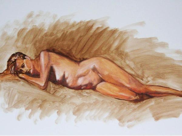 |
This seem to be my year to paint in oil. Since I've never taken an oil class before, I signed up for beginning oil painting class with Andrea Kemp at the Denver Art Students League. I've also signed up for a figure painting workshop with Darren Kingsley at the Bay Area Classical Artist Atelier (bacaa.org) in June.
One of the first thing I did this year was to research about oil paints. They are so expensive so I thought I should be more knowledgeable about the different brands. I've asked several people at the Denver Art Students League and most people uses a variety of brands, often depending on which brand is cheaper or on sale. I also got mixed opinions about student vs artist grade oil paints. Many people said student grades are fine. They just have bit more filler and less pigment but they are much more affordable. Others encourages to buy the best because the artist grades has better tinting strength and a little paint goes much further.
This week I started taking my oil paints to my life drawing sessions and I decided to only bring white, burnt umber, and burnt sienna just to get comfortable sketching with the oil. I bought some cheap Daler Rowney student grade oil paints that was on sale at Hobby Lobby and found myself struggling with mixing colors. It just seemed colors gets muddy rather fast when I mix with white. I thought I find out for myself the difference between student grade and artist grade by mixing a color chart using the three colors. I used paints from the Daler Rowney Graduate oil, Rembrandt, Permalba and Sinnelier. I've also tested several Titanium whites from Daler Rowney, LeFranc & Bourgeois, Winsor & Newton, even a tube of Flake White from Grumbacher. The result as expected the artist grade paints were much more intense. It required less paint to mix the desired value and able to get a wider range of values. The Rembrant oil paint had the most intense color. The Permalba was pretty close but looses it's intensity quicker as whites being added. The Sennelier seemed more transparent and not as dark compared to Rembrandt. The most interesting thing I found was that the Titanium white is very cool. It turned Burnt Sienna quickly to cool red/pink. Flake white on the other hand, maintain the warm tint as more of the whites are added, which is very desirable. What's more interesting is the Daler Rowney Titanium White didn't cool down Burnt Sienna as quickly, probably because of the less pigment of the student grade. This is actually pretty good because Flake White contains lead.
The color chart exercise was pretty educational. I think for my practice sketches, the Daler Rowney paint will work for me. although I will probably bring a tube of Rembrandt Burnt Sienna to get the more intense brown. |
1 comment | Post comment
| HellllOOooo, I think your right the Artist brand will always stand the test of time and my Artist brand ~Art Spectrum is brilliant I love it !!! nice to read your thoughts post the chart eh!!! | -- Sandra Heading , 5/21/11
|
|
2/27/11On the web site wetcanvas.com, other artists and I are painting a reference photo from posespace.com. It's a work in progress (WIP) thread showing each step of the work. It's very interesting to see other artist's style and process. Here is the thread
|
1 comment | Post comment
| You know I hate you now for being so dam good , lol no really I think you rock !!! Im so torn atm their making me resit on my essay, got one thing wrong , its either pass or fail ... | -- Sandra, 3/8/11
|
|
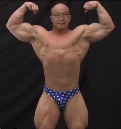
1/1/11An fellow artist asked me for a photo of me to draw so I sent her this photo. Needless to say I was having a great time putting my face in this body and almost rolling on the floor laughing. I am surprised how good I look bald. Not a bad way to start a new year!
Yes, I didn't get even one oil painting done this year. I am ok with that since I've made some breakthrus in my drawing. 2010 has definitely been major improvement over 2009. I have an interesting job that keeps me busy. I'm working with a lot of people I like and I have made a lot of good friends and got to draw a lot. My family is doing good so what else can I ask for. The only sad thing is the passing of my mother in law, who was a really nice lady. We will miss her.
Happy New Year everyone! |
3 comments | Post comment
| LOL , You are so funny Will... Im rolling around on the floor looking at this and that you posted it , way cool !! Im also sad to read of your loss ...My best wishes for you | -- Sandra, 1/29/11
|
| Hi Peter, it's a photo altered using Microsoft Digital Image Suite Editor. | -- William Char, 1/17/11
|
| I like this one. Is it painting or photoshop work? | -- Peter Chien, 1/17/11
|
|
12/24/10 |
The artist journey is full of peaks and valleys. Most of year 2010 I felt I was in a valley where I don't see any notable improvements. Since my last blog, I've been spending time doing studies from photos. Even though most artists would argue that there are many deficiencies drawing from photos, I think it provided me the time to really work on what I've learned during the year. I am pretty happy with my recent progress and feeling like I'm heading in the right direction again.
First of all, the life drawing sessions really paid off. I find drawing from photos so much easier since the model doesn't take breaks and the model always stays in the same place :-). I find I can get a sketch down much faster than the life session. Second, I'm beginning to see the figure differently. Instead of just seeing shapes and values, I am paying more attention to the form. I am understanding why Jacob Collins painstakingly turn the forms to show the roundness of the forms. I am also spending more time looking at the values in relationship to other parts of the figure. Lastly, my motto of the year is don't go faster than I can be accurate and speed will come from practice (from Susan Lyon). This gave me huge freedom of not having to finish the entire figure. Getting a beautiful partially finished drawing is more important to me than getting the whole figure finished.
I've started a sketch book while I was on vacation. The drawings are done mostly with carbon pencil. I have been practicing in my sketch book rendering the round form. It's is a exercise that I need to find more time to do. |
1 comment | Post comment
| Nice one !! like the hand shape , its all about shape and the turning form... | -- Sandra , 12/25/10
|
|
10/31/10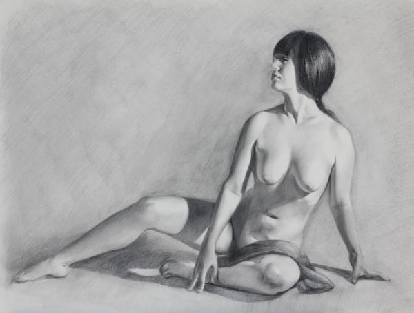 |
I have been in a low in regards to figure drawings lately. I don't know if I'm just burned out between drawing and working, but I have not been very satisfied with my drawing progress. Looking back at my work over the years I'm not sure I have improved or achieved any break through.
On one of the Wednesday nights when I hang out at the Hornet (local bar/restaurant) with my art friends after a drawing session, we looked at some of the drawings in the book Classical Life Drawing Studio. The book is about the teachings at the New York Art Students League and showed art works from students in the past. I was complaining to my friend Larry that my drawings are nowhere close to the drawings in the book. Larry consoled me by saying that the drawing are probably over several sessions and I wouldn't have time in our 3 hour sessions to get to that level of finish.
Larry made me curious about what can I do if I was not limited by time. I bought a reference photo from posespace.com and spend several days drawing the pose. Some days I would spend couple of hours and other days I would just spend a minute correcting something I see. Here is the result of the study. Even though I'm still not satisfied with the result, I learned a lot from the exercise. Having unlimited time allowed me to be more accurate. I was able to measure a lot more and see how different parts of the body related to each other. I also had the time to evaluate values and make sure they are correct. I learned the choice of paper is so important. Unfortunately I picked my favorite Canson Mi-Teintes pastel paper which I fought with all the way thru the drawing. The paper is just too toothy for carbon pencil. It was incredibly hard to get a smooth tone. I was fed up and ended up not polishing the drawing to the degree that I wanted. However, overall I thought it was still a good learning experience. I would like to try it again with perhaps charcoal pencil and Fabriano Tiziano paper. |
1 comment | Post comment
| Hia William , I enjoyed reading your thoughts on this , I think this is a splended effort and a shame you never got the feet done !! but I also know to well, that overwhelming feeling that hits in not finishing artwork also ...:) | -- Sandra, 12/22/10
|
|
8/14/10
In software engineering we always talk about maturity models for different type of system architectures. I've been thinking about an artist maturity model for life drawing, as a way to map out a roadmap for myself and set goals. I would love to hear from anyone who has similar concepts.
Level 1 - the beginner
The beginners draws what they think, not what they see. These people are constantly heads down drawing, instead of looking at the model. They try to draw the details without first establish a structure. They are always frustrated with their drawings and wonder why it doesn't look like the model.
Level 2 - the serious student (me)
The serious student understand the fundamentals of figure drawing and knows how to apply the tools like landmarks, plum lines, proportions, composition, values, and they measure and study the figure extensively (but sometimes too much on details). Their drawings are good but problematic in some areas. They are still struggling to find a process/style that works for them.
Level 3 - the draftsman
The draftsman has mastered capturing the figure and able to render the portrait and figure accurately and life like. The draftsman has established a consistent process for capturing the image they see. However their artworks are as images captured by a camera, lacking a distinct style.
Level 4 - the artist
The artist has not only mastered drawing the figure, they have shifted their focus from drawing fundamentals to communicating ideas and concepts. They are beyond the mechanical process of rendering a image and able to add their personal styles and interpretations to convey a story.
Level 5 - the master
In the movie Matrix, the main character Neo finally sees his virtual world as zeros and ones and realizes he can manipulate the virtual world as such. This is the same for the figurative master, who sees the figure as pure shapes and values. They put down brush strokes and colors that seem random but organize themselves into a master piece. Through their mastery of shapes and values, they manipulate images with intent and simplicity. |
Be the first to post a comment.
|
8/14/10I've been working a lot of 11-12 hour days lately. I guess it's always good to be busy in an economy where people are loosing jobs. However it did put a dent in my drawing time. I did manage to watch Susan Lyon's latest Drawing the Portrait Video. It definitely ansewered many of the questions I had. I highly recommend watching it.
|
Be the first to post a comment.
|
7/27/10At the Denver Cherry Creek Art Festival this year I saw some amazing drawings from Anne London. She draws/paints large art works of animals from Africa. First of all what a nice way to make a living! I am amazed at her technique of very realistic, accurate drawing over very flowing and painterly background. Looking at her art work inspires me to experiment with looser styles and still be the control freak that I am.
Here is her web site:
|
Be the first to post a comment.
|
7/27/10After spending so much time looking and studying Susan Lyon's portraits, I discovered that she has an DVD on portrait drawing. It's great to finally be able to see how she approaches portrait drawing. As always she does a great job of explaining her process and what's important. The only thing is I wish it would have been longer so she can show more of the finishing touches and also tell us which brand of paper and type of paper towel she used. So check out her DVD, it's worth watching.
|
1 comment | Post comment
| a good dvd. http://www.mbtshoes-outlets.com | -- Carriembt123, 10/19/11
|
|
| 6/5/10 Recently I've been having a hard time finding the Conte Pastel Pencil I've been using in my figure studies. The art supply lady told me that Conte will not be making these pencils anymore. This is truly sad since I've been buying these pencils forever. I remember getting my first set back in 1978, trying to learn pastel portrait techniques from watching artists in state fairs. Even though I've bought other brands of pastel pencils, they are just not as soft as the Conte. Rest in peace Conte Pastel Pencil. I will miss you. |
Be the first to post a comment.
|
Previously published:All 31 blog entries William Char's portrait and figurative art work RSS |  |