Blog

2011

3/30/11


Hello again,
Like most people blogs are not always kept due to our personal or business lives as we hope it to be maintained. Whoever came to this page will be rewarded with new updates finally.

First, I have more artworks up. It has been added from time to time for a past few months. There is also a  new gallery too!

Two, I plan to do a new edit soon and replace content with more unified themes.

Three, I plan to show more progress of how my works are created. For those clients who want to see my beginning to end process.

So watch for these changes soon to come.
vinh


Be the first to post a comment.


4 reasons why vinh is good for your company

1/2/09

 Besides being good in drawing I am:


1) CREATIVE/PROBLEM SOLVER- Most often creativity comes from experiences I have witness, seen or researched. Creativity  for me is looking at a visual problem for an obvious point of view and then see how I can approach it from another angle.

EXAMPLE:


The plane and ships I come up with are from a organic life forms I have seen from researched. It is simply a reflection of my visual references I have gathered.  I always try for a simple sihouette first before I GO DETAILS.

SUB IS REALLY A WHALE..THE lines are very curved.

PLANE -has the general forms of today modern plane but it has the thin, sleek sharpness of an eagle. It suggests speed. The narrowness of the snout is of a eagle's beek.

Creavity is what you will get from me.

2) GOOD LISTENER/NOTE TAKER- I think taking notes is very important. When a client hands me a problem to be solved, I listen and then ask specific questions relating to it. I never interupt while they are speaking. I take a mental note or a real note. It's that simple!

3) RELIABLE- commercial art is all about reliabity. A concept artist is the first in the line of creative personnel. We take an idea from words and put it into visuals. I remind myself that people depend on me to solve a specific problem and to meet dealines. You can't do this if you are not confident on drawing fast and effectively.

4) RESEARCH/ORGANIZATION- I myself spend a lot of time researching, not on client or company's time, MY TIME! I have much flash drives, that has specific  visual cues I can draw from fast and efficently. I often tell my students this. research and organization goes hand in hand, I think client and companies appreciate this.

BONUS:

5) SELF MOTIVATED- I have seen my students at times not motivated to draw on that particular day due to whatever the reasons.. I tell them companies don't appreciate this.  I  find the spark in everything you do plus it is commercial art not fine arts. I am happy to be a commercial artist, period. I tell them to be like me.

6) PEOPLE PERSON - My students  have all told me that I am funny and great to be around. I can't imgine that...:)


Be the first to post a comment.


Foundational ground

12/30/08


I would like to share my views on here about art in general.

Here we are:

I feel art output today is vastly different than the masters of the 100 yrs ago. The times were different and the temperment was different. My visit to a museum confirmed this. Anyone who is a serious  realistic artist should go to a museum be it fine or commercial to study the control back then. You don't know till you go see it. The reproductions in books never quite tell the story.

let me address them by points,

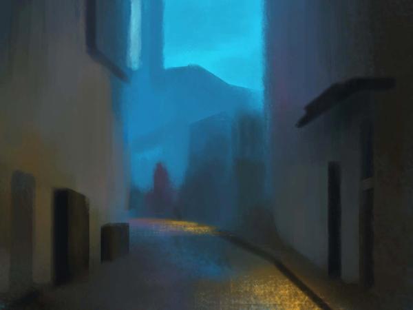
1) dimension.... I saw some paintings that didn't look like paintings! Not photoreal of the 70's reality real. Real like you can touch it and reach through the picture plane real! It transended a painted picture.

2) execution..... this one is always measured to the skill level in some factor.

execution can be tight or loose... there is no one superior way. It is how and where it is used. Doing a picture too tight  everywhere is not visually correct nor too loose everywhere. I am talking about quality paintings with much understanding not commercial or concept paintings.

The master knew it and based everything on their own observation against nature. Objects are clearer, sharper and has  more contrasts in the foreground from the artist's POV. Of course objects inthe backgroud are opposite to this rule. I saw examples of this in the museum. The results are really amazing.

3) value ratio..... How  light or dark to make something can cause a visual lie.

The degree or assigned value to each area based on spatial distance to each object becomes critical for becoming reality REAL. In reality, everything has an order from contrast to details. The master often got this right. Yes they based everything on observation from life BUT it is their keen observation that served them well in their paintings. That is why art school always have life drawing classes.

4) color control.... This I will never forget! I attended a HUDSON RIVER SCHOOL SHOW IN NORTHERN CA A FEWS YEARS AGO, and saw a set of paintings that

knocked my socks way off! the color degrees assignment was very well thought out. I could see their control was second to none. Once in awhile, I see these matte paintings done but today fine digital artists and I can see they haven't quite gotten the control as say Ralph Marquirre , Peter Ellenshaw or chris evans to name a few. It is NOT THE TOOLS OF PHOTOSHOP BUT THE UNDERSTANDING OF THE ARTIST THAT MAKES AN IMAGE CONVINCING. Bad mattes are the one that stick out like they don't belong with the rest of the scene! why????

Because, of the 3 point above is not quite fitting in. To find the correct ratio is like cracking a safe. NOT EASY... YOU GOT TO BE SKILLED IN EXECUTION AND UNDERSTANDING.

Next time, i will talk about emotional content of art... stay tuned.

PLEASE CHIME IN if you have something to add.


Be the first to post a comment.


www.zhibit.org/mvstudios


RSS RSS  | Sitemap
Copyright © 2012 ▪ Terms of usePrivacy policy
Art lives at Zhibit.org