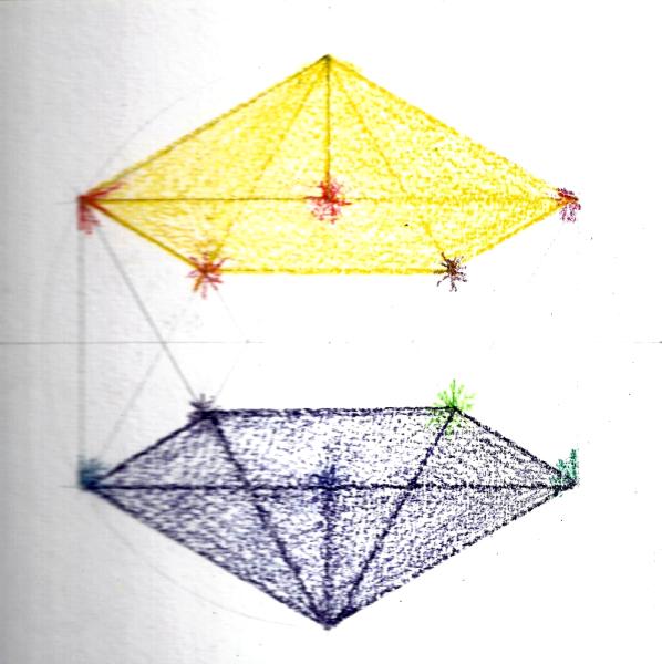
. . . .first idea Left = front (exterior?) = light = yellow/red Right = rear (interior?) = dark = blue/violet
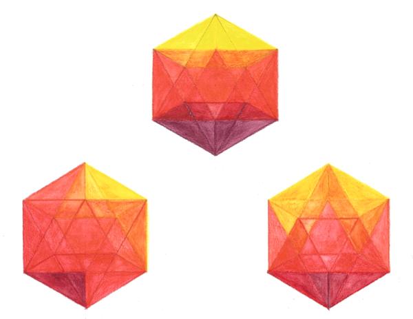
Middle = combo! Dark Half Combination More experiments - quite fun! . . . another layer seems worth it?
I am trying to get a sense of transparency.
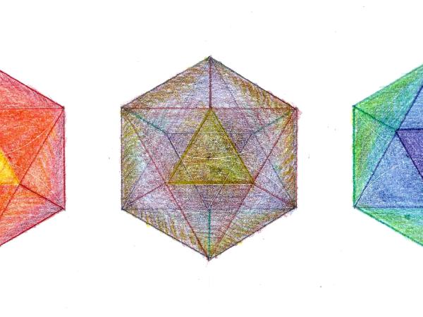
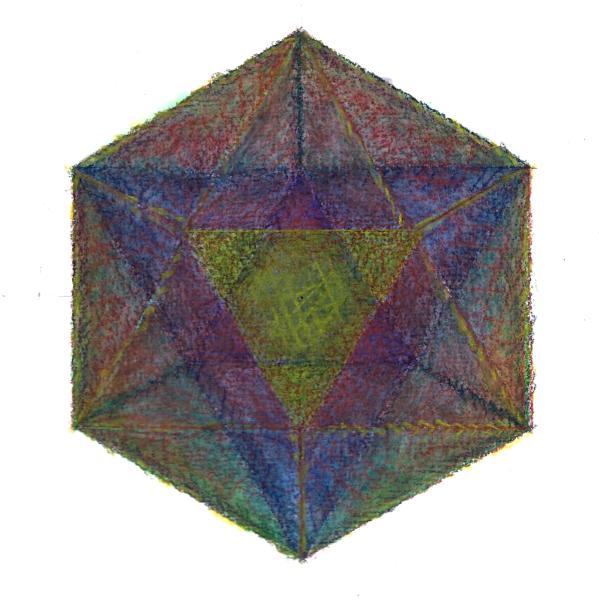
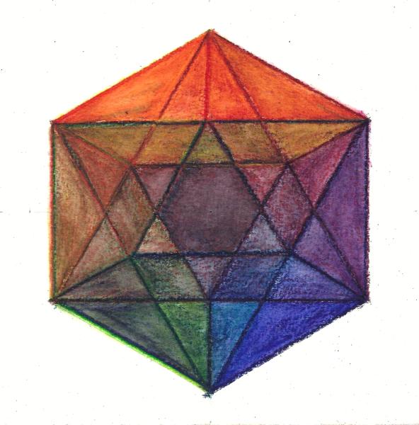
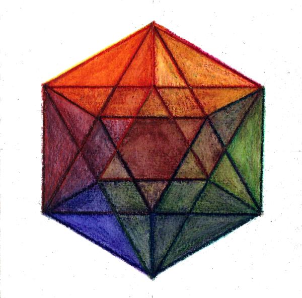
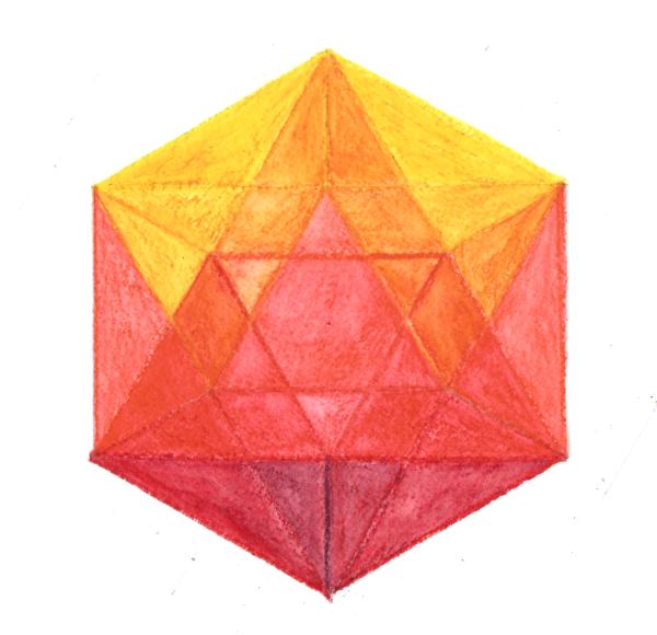
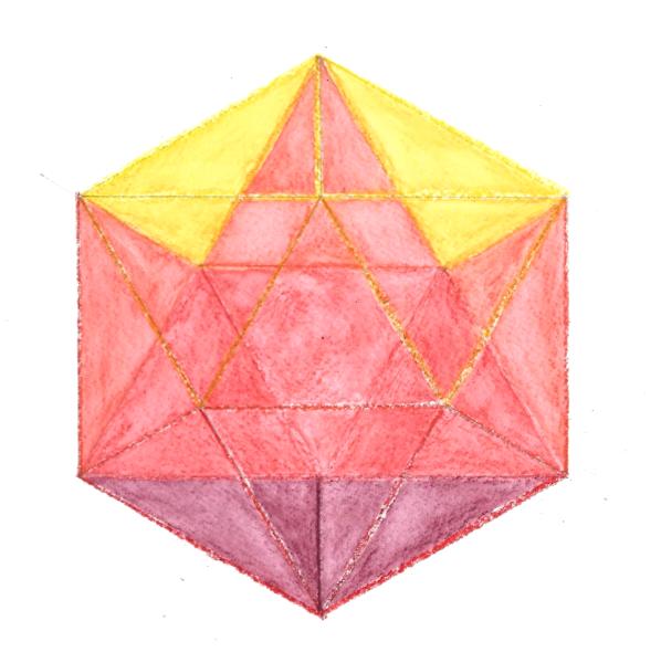
Colors are applied to equilateral triangles treating the whole as if it were a three dimensional model - each facet is a mix of two of these overlapping faces but I am trying to keep a sense of the form as a whole. Less colors but I was trying to be consistent with a single point of light on a (transparent) solid form. Why not assign a different color to each of the twelve vertices and allow them to radiate out from there? Each of the twelve colors then spreads over five triangles and each triangle becomes a mix of three colors, determined by the three corners . . . or would be if I wasn't also treating each surface as transparent, making for four, five and six color mixes! I based the last one on the polarity yellow (light) purple (dark) and then followed a color sequence similar to the I Ching paintings with red/orange above and blue/green below. However I paired the colors in sequence from bright to dark - which ended up with some curious adjacencies such as orange being next to green (which works well for the I Ching sequence but possibly not here). For my second attempt I made sure that every color was opposite its polarity . . . . . . . . which is much more consistent I think, but I kind of miss those lovely blue violets!
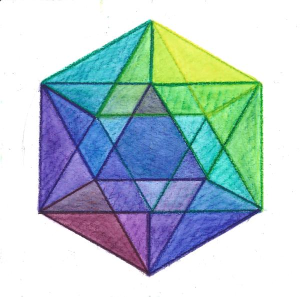
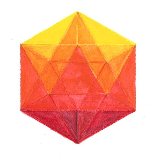
n.b. The primaries have completely given way to secondaries and tertiaries here. It might be fun to keep this arrangement but "rotate" the solid form. In this version yellow and purple are above and below, red and blue are front and back. Imagination of light striking a vertex (previous version was a single surface)
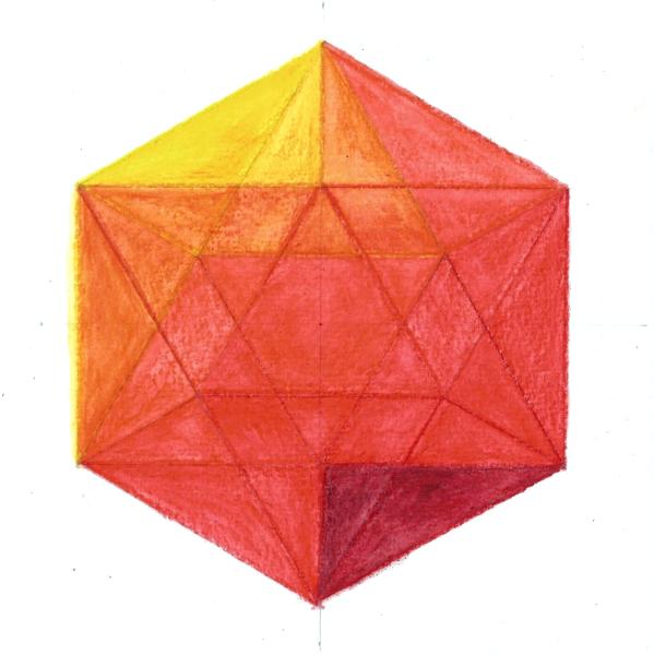
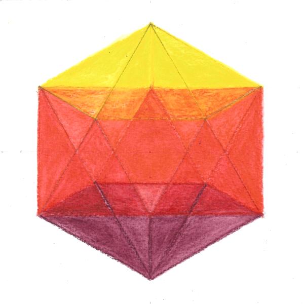
This one only used four colors, surface and edge use six. Imagination of light striking a single edge. Asymmetry is not a mistake!
I like this one! Here's another go where I am making an attempt to distinguish foreground from background rather than just have the more dominant colors pop to the front. The firs shows the ten "background" triangles and then the compilation. |