December 5th: Picked up the prototype P.S.T. shorts yesterday and they are perfect! Well done Birdwells (they did look a bit exhausted)! Had to get up in the middle of the night to work out all of the logical permutations for color combinations. After a few mess-ups and some surprising increases in the number of options I resolved on this: 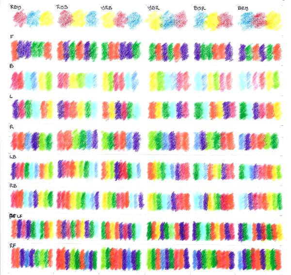 Once again it's 6 x 9 - which with 6 x 4 photographs ends up again at 36" or 3' square! There would be more options if I was allowed to fold the shorts to show all four surfaces but for now they should be treated as solid objects, in which case a maximum of three surfaces are visible at a time. I considered re-creating the above with a clothes line and pegs but decided for now that in order to simplify things for a first batch of photo's I will have one model in eight poistions (a "Mariner's compass") for each of the three pairs of shorts, which will give me everything I need to collage this together on the computer - in just 24 shots (plus the three "above" views - which would be technically impossible with a model!!) . When I had a moment (waiting for an Algebra student in the library!) to plan this out I found something wonderful:  I think that simple arrangement does include all possible options one time with nothing superfluous! Aren't systems wonderful!! The first layout is way too busy to look at but I don't think it contains anything that cannot be found in the second. Here's the colors that meet at the borders: 1: Orange) Purple:Purple Green:Green (Orange: 2: Crimson) Vermilion:Aqua Sky:Gold (Lime: 3: Purple) Crimson:Green Aqua:Orange (Gold: 4: Vermilion) Orange:Sky Purple:Lime (Green: 5: Purple) Vermilion:Green Sky:Orange (Lime: 6: Crimson) Orange:Aqua Purple:Gold (Green: 7: Orange) Crimson:Purple Aqua:Green (Gold: 8:Vermilion) Purple:Sky Green:Lime (Orange: Excuse me but I'm feeling smug! December 8th: Always watch out for the smug ones! The "morning after" I realise that essential combinations such as Purple:Gold and Orange:Lime are absent - oh, here's a full list: Orange:Crimson Orange:Lime Purple:Vermilion Purple:Aqua Green:Sky Green:Gold Crimson:Aqua Crimson:Sky Crimson:Gold Vermilion:Sky Vermilion:Gold Vermilion:Lime Aqua:Gold Aqua:Lime Sky:Lime But I want to see all of those! I tried transposing the Yellow and Red and came up with a second table:
 Two wonderful things: - The first four rows check off the missing combinations without any repitition
- In the fifth and sixth rows everything falls into "natural" color order - as in a rainbow (non-Newtonian of course) - which I had quite forgotten about!
. . . and then one perturbing thing - there are still six combinations missing!!! Crimson:Aqua Crimson:Gold Vermilion:Sky Vermilion:Lime Aqua:Gold Sky:Lime . . . which are all tertiary combinations. Where can they be found? Reason: The left rear panels are logically never adjacent. The right rear panels are logically never adjacent. Solution: Somehow shift left <-> right for one of each pair In the practical language of Beach Shorts, someone needs to do a handstand! (Alternative: Lying on beach towels "like sardines in a tin"!) In practice if Blue does a handstand and Red and Yellow alternate sides the missing options fall into place. All of them? No! To complete the series one of Red or Yellow will need to do a handstand too! Complet!   Previously: I was intending to get down to Birdwell's last week but they were closed for vacation - don't you love that when a whole (small) factory has a "vacation week"? How modern it is to choose your own vacation dates!
However, I did get down there this week with some revisions, the new designs and at least one radical new idea* for a rummage through the color cupboard.
I now have all my tertiaries assigned:
Scarlet = Lifeguard Orange
Gold = Gold!
Citrus = Hot Lime! (Kelly Green is just too safe!)
Blue/Green = Teal (that was a tough choice - they have a beautiful Turquoise, and Aqua is my favorite!)
Blue/Violet = Sky
Rose = Burgandy (Birdwell's spelling) (I wouldn't have chosen this unless I'd done my own experiments and also seen that Rothko play! Red over Purple gives a classic color of hardened blood!)
. . . . . I can't wait to see them! 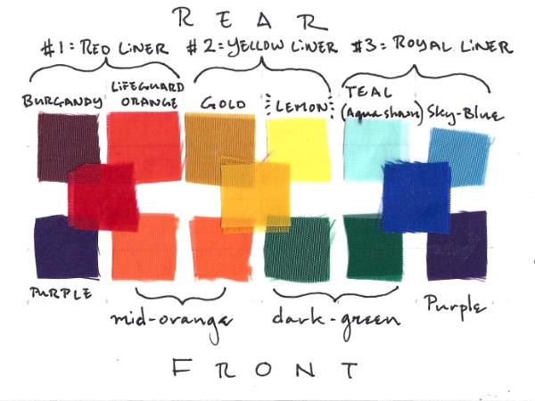
*Radical New Idea: it's the inside!! - the P.S.T. shorts now have primary colored linings instead of hems - (those hems have always bothered me - if this works I will revise the Saggital trunks as well). This means that the primary colors around which the theme is based will not actually be visible on the exterior (except for glimpses) - which is quite bold I think! The main design is still three secondaries accross the fronts and six tertiaries accross the rears as previously. Choreograpy will be required! n.b. I had to change the "citrus" from "hot lime" to "lemon" which seems a shame but the hot lime was flourescent and too disruptive to the sequence.
Here is a painting I did to check the tertiary colors:  Both "Gold" and "Citrus" are quite clear - the gold has a little black and I certainly would take lime over lemon if available but it's not currently on the Birdwell palette.
The interesting one for me was to find out more about "coral" which I assumed was stepping back from orange towards red but there is something very close to the Birdwell's coral here which is simply a mix of orange with white (and quite lovely!).
Not so keen on the execution on this one (I was in a bit of rush with a practical rather than aesthetic purpose) but I do like the form (from the CMYK days) and will hopefully return to it for all three secondaries. | 


